Customizable fields
To add a customizable field to the process:
- In the Forms Designer, drag-and-drop a Customizable field in a table ;
- Select the field to assign to the graphical control.
- In the properties panel, enter the configuration needed in the “Graphic control class” zones.
Existing fields
The following sections present the different types of customizable fields deployed and supported by Process.
Document fields
| Name | Class | Attributes | Description |
|---|---|---|---|
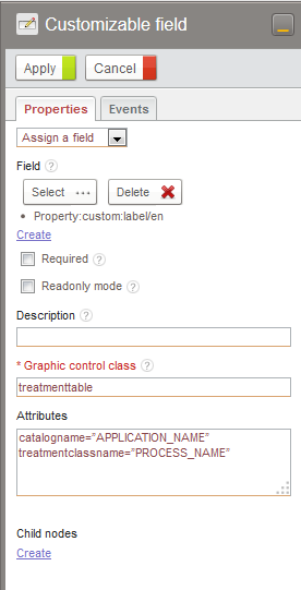
| Table of linked documents | treatmenttable | catalogname=“APPLICATION_NAME” treatmentclassname=“PROCESS_NAME” |
Table of documents linked instances of the PROCESS_NAME process of the APPLICATION_NAME application |
| Group of checkboxes | checkboxgroup | fillingmode=“vertical” nbofcolumns=“n” allowreset=“true” allowselectall=“true” |
This field type applies to multiple selection list-type fields The parameter ‘fillingmode’ can have the vertical or horizontal values. This parameter indicates the filling way of tickboxes group. The second parameter ‘nbofcolumns’ corresponds the the number of columns wanted. ‘allowreset’ and ‘allowselectall’ respectively enables to select and deselect every elements. |
| Radio button group | radiogroup | fillingmode=“vertical” nbofcolumns=“n” allowreset=“true” |
This field type applies to multiple selection list-type fields The “fillingmode” parameter can take the values vertical or horizontal. This parameter indicates the filling way of tickboxes group. The second parameter ‘nbofcolumns’ corresponds the the number of columns wanted. The parameter ‘allowreset’ enables to empty the selection. |
Auto-complete list for a high data volume
This field allows you to plug a list (internal or external) into an auto-completion field, and load the data using Ajax. This ensures that the loading of the form is not slowed down in the case of a large volume of data.
| Name | Class | Field type | Description |
|---|---|---|---|
| Auto-complete list | ajaxSingleSelector | Text | Automatically filters a data list based on what was typed and lets you select an item only. |
| Multiple auto-complete list | ajaxMultipleSelector | Text | Automatically filters a list of data based on what was typed and lets you select multiple items. |
Auto-complete list attributes
| Attributes | Description |
|---|---|
| listName | The list name linked to the field. Mandatory. |
| protocolUri | The URI Protocol of the list linked to the field. |
| minSearchCharacters | Minimum number of characters before launching the search (default 3). |
| filterColumn | The column used to make or apply the filter. |
| isVisibleOpener | Displays the navigation button in the field (false by default). |
| maxFilteredItems | Maximum number of items returned by the filter. |
| minItemsToSelect | Minimum number of items to be selected ( for multiple selector) |
| maxItemsToSelect | Maximum number of items to be selected ( for multiple selector) |
Directory selector
Single selector
| Name | Class | Attributes | Description |
|---|---|---|---|
| Person selector | user_browser | Simple user selector | |
| Group selector | group_browser | Simple group selector | |
| Organization selector | organization_browser | Simple organization selector | |
| Localization selector | localization_browser | Simple localization selector | |
| Entry selector in Document spaces | com.axemble.vdp.ui.core.document.fields.SingleDirectoryField | Single selector in FileCenter Deprecated, use FileCenter selector instead. |
Multiple selector
| Name | Class | Attributes | Description |
|---|---|---|---|
| Person selector | user_browser_multiple | Multiple user selector. Note: equivalent of persons selector. |
|
| Group selector | group_browser_multiple | Multiple groups selector | |
| Organization selector | organization_browser_multiple | Multiple organizations selector | |
| Localization selector | localization_browser_multiple | Multiple localizations selector | |
| Entry selector in Document spaces | com.axemble.vdp.ui.core.document.fields.MultipleDirectoryField | Multiple selector in FileCenter Deprecated, use FileCenter selector instead. |
FileCenter selector
Since Process2025.1.0, this field exist as a default field in the studio and should not exist through a customizable field anymore.
| Name | Class | Attributes |
|---|---|---|
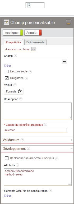
| FileCenter selector | com.axemble.vdoc.sdk.document.fields.SelectorField (selector) |
screen=filecenterNode method=select |
The associeted field type must be “Text (reference to an object)”.
Configuration
| Name | Value | Description |
|---|---|---|
| selectable |
|
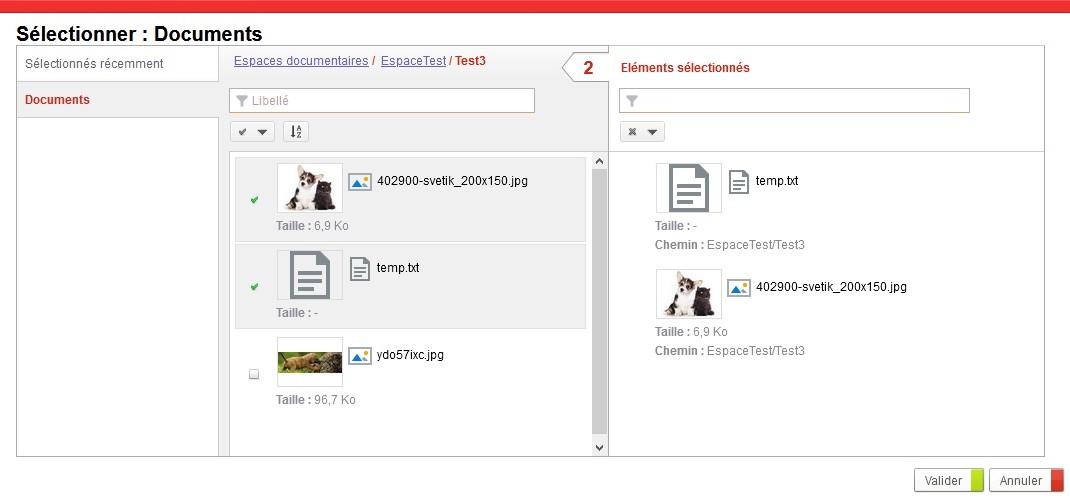
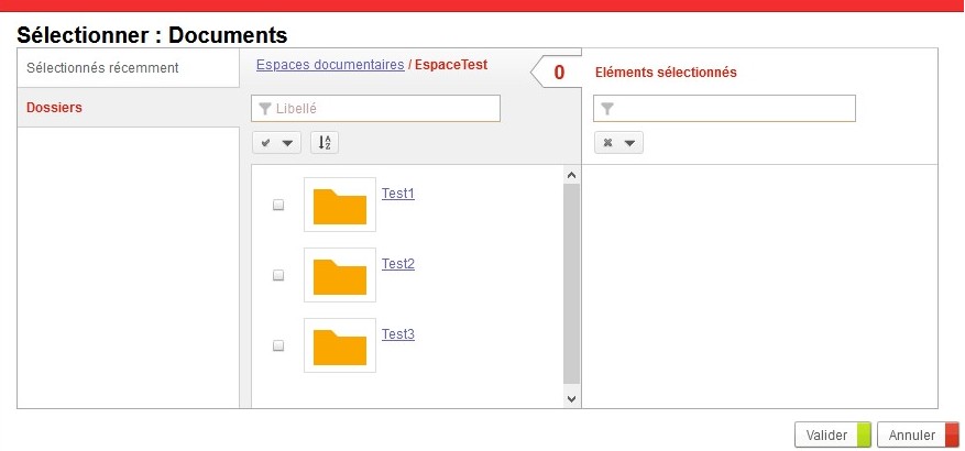
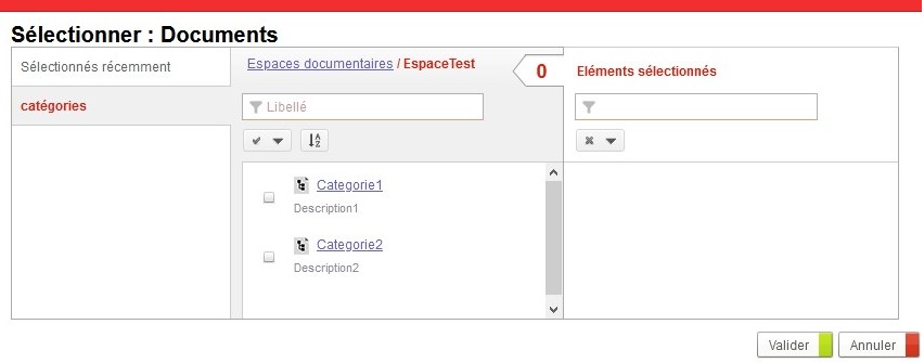
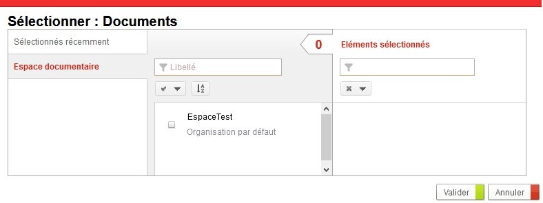
Type of object that can be selected (illustrations below). |
| multiple | true or false | Ability to select multiple objects (default to false). |
| datastoreids | List of JDO identifiers separated by ‘;’ | List of spaces in which the selector can search (by default all). To find the JDO identifier of a space :
|
| parent | FileCenter or Folder (only in SDK) | Root of the selector (by default the root of all spaces). Should receive a datastore or folder JDO object (xxx.getNativeObject()) in SDK. This parameter can not be used in the graphical interface. |
Example
Here are examples with multiple selectors:
Source : https://wiki.myvdoc.net/xwiki/bin/view/Dev+Floor/FileCenterSelector
JSP page selectors
| Name | Class | Attributes | Description |
|---|---|---|---|
| Example of JSP page selectors | jspsample_browser | This selector lets you make specific developments around documents in a JSP page. It integrates a configuration mechanism while starting the JSP page and a document updating system during its validation. |
The FCK Editor field
Since Process2025.1.0, this field exist as a default field in the studio and should not exist through a customizable field anymore.
| Name | Class | Attributes | Description |
|---|---|---|---|
| FCKEditor | fckeditor | width: 100% height: 300 |
This field integrates the FCK Editor component. It permits to benefit of the same options via a customization. |
The EnhancedUrl field
| Name | Class | Attributes | Description |
|---|---|---|---|
| EnhancedUrl | com.axemble.vdoc.sdk.document.fields.EnhancedUrlField | title=“Visiativ Software” description=“Editeur de logiciel” url=“http://www.vdocsoftware.com” |
This field enables to create a URL link by specifying the link title, the description and the opening settings. It is possible to make the data entry areas appear or not. Indeed, the following attributes may be used:
script ![CDATA[function onAfterLoad()//var url = iResourceController.getDefaultWidget( "fldURL" ); //deprecated since 2025.1 removed in 2026var url = iResourceController.getDefaultIWidget( "fldURL" ); //since 2025.1url.setTitle( "Visiativ Software" );url.setUrl( "http://www.vdocsoftware.com" );url.setDescription( "Editeur de logiciel");]] /script |
Color picker
Champ de sélection d’une couleur.
Classe : com.axemble.vdp.ui.core.document.fields.ColorPickerField
Stockage : String
Pas d’attributs sur ce champ.
Screen embedder
Enables to embed new screens
Class: Com.axemble.vdp.ui.core.document.fields.ScreenEmbedderField
Shortcut: screen_embedder
Java type: java.util.Map
Storage table: vdp_byte_values
Example:
<field name="fldEmbedder" label="fldEmbedder" ctrl="com.axemble.vdp.ui.core.document.fields.ScreenEmbedderField" mode="write" screen="jsp_selector" method="select" />Implementation
The UI framework enables to create new fields that may be easily integrate in the process documents or generic screens.
To create a customizable field, you just have to create a Java class which extends the basic class
named com.axemble.vdoc.sdk.document.fields.base.BaseField.
The following code delivers the required methods to implement in order to create a field class:
public class SimpleField extends BaseField {
    public void init(Element element) {
    }

    public void updateControl() {
    }

    public void updateValue() {
    }

    public boolean isEmpty() {
        return false;
    }

    public IWritable render() throws RenderException {
        return new CtlButton("okButton", new CtlText("Bouton OK"));
    }
}
The method init() receives as an argument the object org.w3c.dom.Element representing the fields XML description in
the customization forms or the definition file screens.
The method updateControl() is called each time the field internal value is affected. The framework requests the
implemented field to update depending on its value.
The method updateValue() is called each time the user modifies the values in the HTML document.
The method isEmpty() must be filled in by the implemented field. In the case of the field is set as compulsory and if
this method returns the “true” value, the framework will indicate the field must be filled in.
The method render() is called by the framework to integrate the field graphical part in the HTML document. In the
previous example, the graphical component displayed will be a button.
HTML templates definition
The customizable fields may be composite components of graphical elements suggested by the Process framework (using of Container widget). In this case, there is no need to define a HTML template.
However, in several cases, you will need to define several HTML templates functions of an internal state of the field (
example: write mode, read mode). The Process graphical interface framework has a “custom” folder to put the specific
HTML templates: WEB-INF\storage\custom\controls. By delivering the HTML templates in the folder, it will be possible
to reach them via the method getTemplateWriter().
Example of HTML template
In this example, a whole of tags surrounded by the « $ » symbol is displayed.
<input type="text" name="$id$" value="$label$">
$error-message$
Example of using an HTML template
This example shows how to bring a TemplateWriter object back from an HTML file (HTML template).
Once the TemplateWriter is brought back, it is possible to replace the $xxx$ tags by some IWritable-type elements
thanks to the setEntry() method of the TemplateWriter class. It is also possible to bring a EntryWriter object back to
log several elements of IWritable-type in one tag: using of the getEntryWriter() method in the TemplateWriter class.
public IWritable render() throws RenderException {
	if ( isHidden() ) {
	  return null;
	}

	TemplateWriter tw = null;
	if ( this.isEditable() ) {
	  tw = this.getTemplateWriter( "CtlTextBox.edit.html" );
	  tw.setEntry( "id", new TemplateToken( this.getNavigator().registerWidget( this ) ) );
	  tw.setEntry( "label", new TemplateToken( HTMLUtils.getHTMLAttrString( this.textValue ) ) );

	  if ( checkErrorMessage() ) {
		tw.setEntry( "error-message", this.renderErrorMessage() );
	  }
	} else {
	  tw = this.getTemplateWriter( "CtlTextBox.read.html" );
	  tw.setEntry( "label", new TemplateToken( HTMLUtils.getHTMLString( this.textValue ) ) );
	}

	return tw;
}
Implementation of a customizable field dedicated to the process
A field dedicated to process document can just be used in the process document context. It can only be defined in a generic screen.
To implement such a field, you just have to create a Java class which extends the class
named com.axemble.vdoc.sdk.document.fields.base.BaseWorkflowField.
