Group
The “group” element enables to group several screen templates. For example, an entering simple form may be grouped with a view to display a search result.
The user interface associated with the “group” tag is produced by the following class template: com.axemble.vdp.ui.framework.composites.xml.XMLGroup.
The provider class to be used must extend com.axemble.vdoc.sdk.providers.BaseGroupProvider.
Example
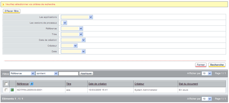
In this example, two screens templates are used:
- a form, enabling to display the search form;
- a view, enabling to view the search result.
<group name="DEMO_GROUP" action="action1" label="LG_DEMO_GROUP" provider="com.axemble.education.providers.demo.DemoGroupProvider">
    <form name="DEMO1" action="action1" label="LG_DEMO1" information="LG_DEMO_INFO" provider="com.axemble.education.providers.demo.DemoFormProvider">
        <fields>
            <field name="fldLabel1" label="LG_LABEL1" ctrl="com.axemble.vdp.ui.core.document.fields.TextBoxField" mandatory="true" />
            <field name="fldLabel2" label="LG_LABEL2" ctrl="com.axemble.vdp.ui.core.document.fields.TextBoxField" mandatory="false" />
        </fields>
    </form>
    <view name="DEMO2" label="LG_DEMO2" selectable="true" provider="com.axemble.education.providers.demo.DemoViewProvider" paginable="true" filterable="true">
        <image name="properties">
            <action class="DEMO" name="edit"/>
        </image>
        <column name="column1" label="LG_COLUMN1" zone="title"/>
        <column name="column2" label="LG_COLUMN2"/>
    </view>
</group>
Group preview